View toolbar
Find the view and navigation tools in the View tab. View and navigation tools allow user to view objects from different angles, heights, and distances.

View Panel –
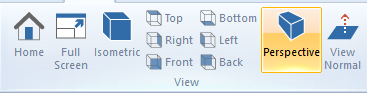
Set the view to the default orientation using Home button. Full Screen button enable user to toggle full screen mode.
Glovius provides a set of Standard Views for a 3D scene. Preset camera views (Isometric, Front, Back, Top, Bottom, Right, Left) can be selected from the View panel. Use perspective button to check perspective projection of the component.
Use View Normal button to view opened component normal to the screens for the analysis.
Animation Panel –

Play the animation with standard views as well as model views.
Render Mode Panel –
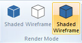
Render determines how an object will be drawn on screen. Following render modes are available in Glovius –
- Shaded – Component is colored but the edges are invisible.
- Wireframe – Transparent outline of each segment.
- Shaded Wireframe – This is default render mode in Glovius. Component is colored and the edges are visible.
Navigation Panel –
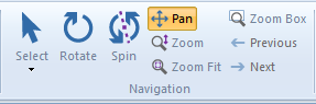
Select is the default setting when a 3D document is opened in Glovius. Click on the model and drag with pointing device. Select Box enable user to select the components in the specified box.
Rotate function enable user to rotate opened 3D part or assembly. With the help of wheel mouse, a user can rotate the model by pressing down on the wheel while dragging.
Spin function enable user to select a point on the component and rotate the component along selected point. Pan enables user to drag the view horizontally and vertically.
Zoom simulates moving the camera closer to an object or farther away. Zooming in magnifies the image.
For effective analysis use other zoom options like Zoom Fit, Zoom Box.
To check previous view user can use Previous button. Next button can be used to check next view. It supports camera changes, transformations, color changes, assembly part visibility.
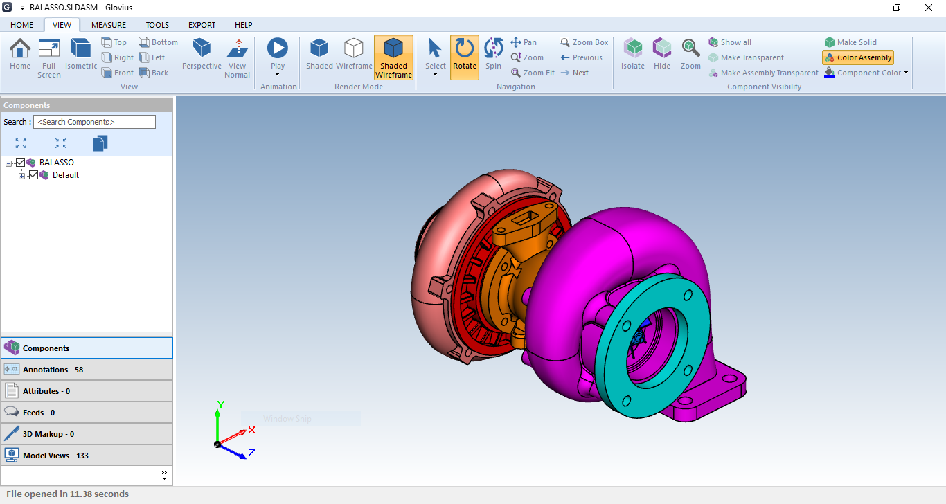
Component Visibility Panel –
Sometimes it’s challenging to identify the components from an 3D CAD assembly file. Most of the time, CAD file does not have color. To overcome this Glovius have features like Isolate, Hide, Color Assembly, Component Color etc. These features are available in the View tab, Component Visibility panel. With the help of these visibility, transparency and color commands user can work efficiently with an assembly, sub-assemblies, and parts. These are read only or session specific controls. This means after closing Glovius the color of components reset to original.
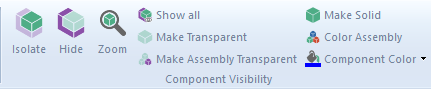
- Isolate – Select a component from assembly or sub-assembly to view and hide others.
- Hide – Select a component from assembly or sub-assembly to hide.
- Zoom – Select a component to zoom into it.
- Show all – Show all hidden components.
- Make Transparent – Select a component to apply transparency effect.
- Make Assembly Transparent – Select an assembly to apply gradient transparency to its components.
- Make Solid – Select a component to make it solid.
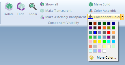
- Color Assembly –
After clicking this button, all components from assembly file will get different colors.
It will help user to visually differentiate the components from an assembly. - Component Color –
To give color to a specific component in an assembly user can use this option.
This will work with single part as well.